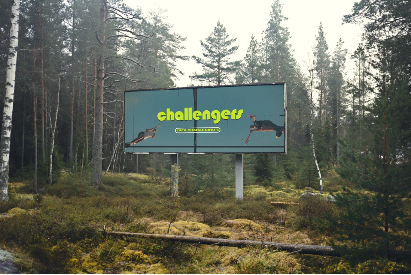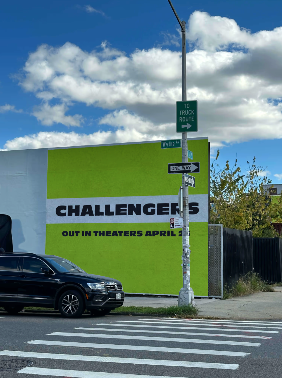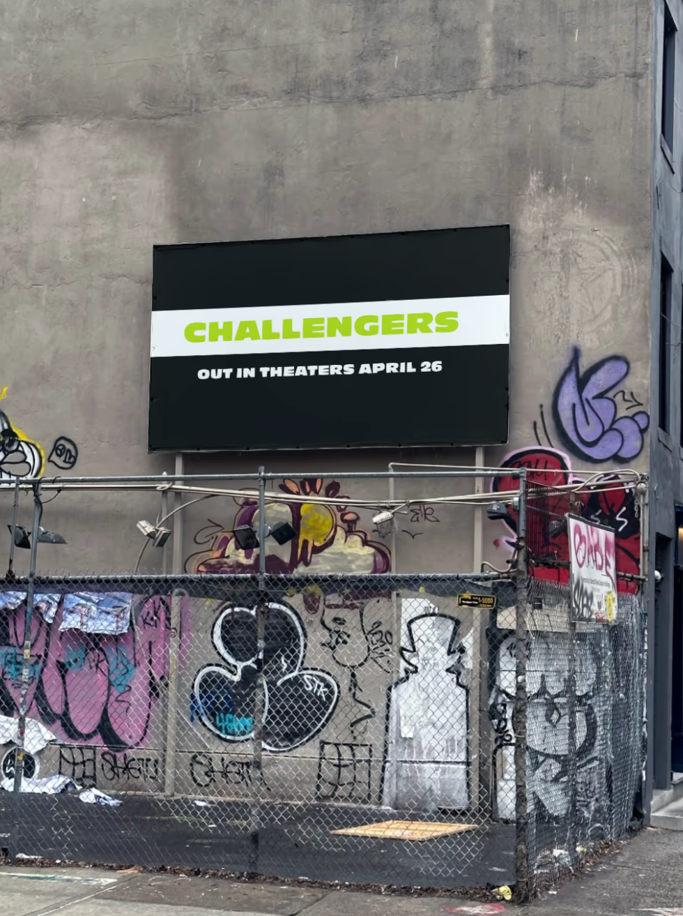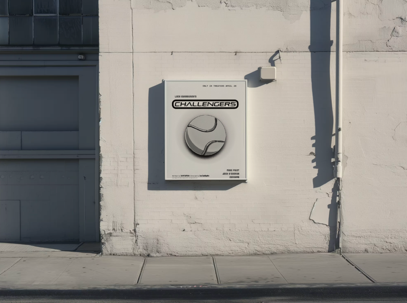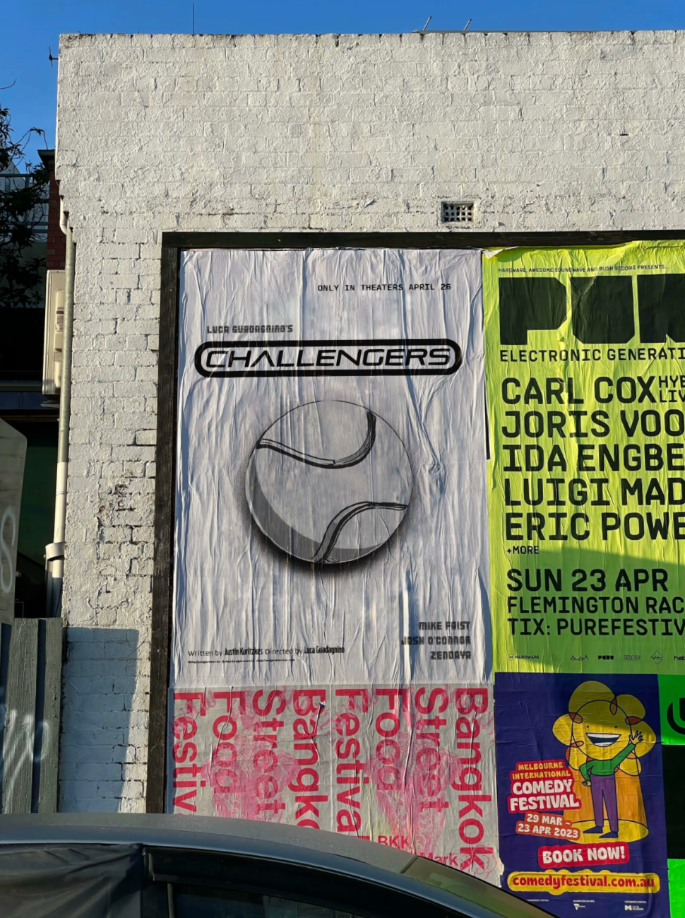
For this school project, I reimagined the marketing campaign for Challengers with the goal of engaging an audience that the original promotion failed to capture. While the official campaign lacked focus and struggled to resonate, I developed a design strategy centered around tennis, bringing the sport to the forefront to better align with the film's themes. I designed a range of promotional materials, including posters, social media posts, billboards, a redesigned film poster, updated typography for the film title, and a new color guide to unify the film’s branding. Adobe Illustrator was my primary tool, and I sourced supporting imagery from IMDB. For the redesigned poster, I used bold typography and a chrome effect to create a modern and eye-catching design. I felt the movie required a louder, bolder font to match its intensity. Using black emphasized the boldness while keeping the design sleek. The primary palette featured tennis ball green and white to tie directly to the sport. I developed a secondary palette inspired by prominent colors found in stills from the movie, ensuring the design reflected the film’s visual tone. The new marketing campaign connected more directly to the essence of the movie, emphasizing its themes and appeal to tennis enthusiasts. My classmates, including students from graphic and interior design, praised the campaign for its cohesiveness and boldness. This project taught me the importance of time management, the necessity of mockups to visualize designs in real-world settings, and the value of creating style guides for cohesive branding. It also improved my ability to develop a unified design system within a short timeframe. While I’m proud of what I accomplished, I would love to spend more time refining the designs further.